Monday, 22 August 2022

ORIGINAL ART: Heros the Spartan - faded

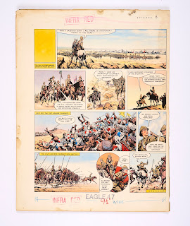
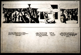
"Heros the Spartan" Eagle Vol.16:12 (20 March 1965)

 This is just a quick entry to record the sale of a "Heros the Spartan". This escaped my alerts in 2019 and therefore I didn't get to see it until now.

Drewatts Online sold it for the reserve price of £130 (and the estimate was £150) in November 2019. Their description was accurate in parts:

Description
Double page format, circa 1962/63, framed and glazed pen, ink and tinted comic page, Episode 4 for The Eagle, lettering with corrections, signed, image 39 by 63 cm, framed and glazed with cropped mount detailing details of publication, 55 by 77.5 centimeters (2).

Status report
Fading in the sunlight, colors now very muted, unexamined outside the frame.
Boy oh boy is it faded! It has almost become an interesting outline of the blacks that Bellamy used! The date is completely wrong. It's from the fourth and last story Bellamy drew in the comic (there was one more Heros in the Eagle Annual) "The Slave Army" and it is indeed episode 4 of that story.

Want to see HOW faded it is:

"Heros the Spartan" Eagle Vol.16:12 (20 March 1965)

Faded original

You're welcome! Such a shame it has been allowed to get that faded! That central panel is just gorgeous and so memorable. And just in case anyone thinks Bellamy used "white-out", contrary to what's been said, that's the balloon letterer's mess!


Sunday, 14 August 2022

ORIGINAL ART: Too many to mention but I will!


Eagle 22 November 1957 (Vol. 8:47)
The Compalcomics auction have some tremendous Bellamy original art this time. The hi-res images I have below have been grabbed from Thesaleroom where you can bid and see live bids too.

HAPPY WARRIOR (Churchill)

Lot 44 is a rare page from "The Happy Warrior", the story of Winston Churchill the first living person to appear in the biographical strip on the back page of Eagle. Bellamy must have had a lot of worries representing this national hero, but eventually was told Churchill approved. This is episode 8 (as Bellamy has written on the board) and appears to have preserved very well. Whoever gets it - please - do not put it in sunlight! The story ran for a year form October 1957 to September 1958.

The lot is described as:

Eagle/Happy Warrior original artwork drawn and painted by Frank Bellamy for The Eagle Vol 8 No 47 (1957). During the second Indian War at the battle of Omdurman on 2 September 1898, a young Lieutenant, Winston Churchill, with 350 men of the 21st Lancers charged what they thought were an army of 700 Dervishes. Churchill later wrote 'A deep crease in the ground - a dry watercourse - a khor, appeared where all had seemed smooth, level, plain; and from it there sprang, with a suddenness of a pantomime effect and a high-pitched yell, a dense white mass of 2000 tribesmen and a score of horsemen with bright flags who rose as if by magic from the earth...' Bright Pelikan inks on board. 21 x 16 ins.

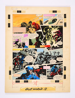
Boy's World 28 March 1964

 
BRETT MILLION AND THE GHOST WORLD

The 17th part of this single story from Boy' World (28 March 1964 Vol 2:13) is the next item in the auction. This was a story Bellamy drew as a one-off (there were 21 parts to the story), taking over from "C F Eidlestein" as artist on this strip, who was better known by his real name Frank Langford. The story's premise was similar to the later published Star Trek episode "Wink of an eye" Besides an illustration for a text story this is the only work Bellamy did for Boy's World. To read more about this short-lived comic you cannot do better than Steve Holland's "Boy's World: Ticket to adventure".

Anyway, the lot (#67) is described thus:

Boy's World/Brett Million and the Ghost World original artwork (1963) drawn and painted by Frank Bellamy for Boy's World Vol. 2 No 13, 1963 [sic]. Brett is captured and suddenly teleported by the Aliens as his amplifier runs dangerously low… Bright Pelikan inks on board. 20 x 15 ins 

Eagle 17 November 1962 (Vol. 13:46)

HEROS THE SPARTAN

Heros the Spartan original double-page artwork (1962) painted and signed by Frank Bellamy. For The Eagle Vol. 13 No 46. Taken prisoner to the mountain Palace of Gold, inhabited by the priests of the pagan god, Diom, Heros and his cohort survivors are forced to fight duels against the wild, animal-like savages called the Magus... Bright Pelikan inks on board, 28 x 20 ins. The Heros title lettering and rectangular text boxes are laser colour editions to complete the look of the artwork and may be removed if required. *This is the final board of Heros artwork in the recent run offered for auction.

Comparing this original art to the comic it's hard to tell if this is faded (which wouldn't surprise me) but I can see the blues in it. However Malcolm does mention  the title lettering and text boxes have been added so who knows. It's full of action and comes from the first story of Heros - "The Island of Darkness" which ran for four months over 1962/1963

Lots #102, 104 and 109 are all Garth strips. The first comes from "The Wolfman of Ausensee" (F162) and shows Garth worried about Gloria as she stands on a ledge, for the film crew.  I remember as a teenager trying to copy how Bellamy drew rocks and mountains.

Garth: The Wolfman of Ausensee" G162

Garth: 'The Wolfman of Ausensee' original artwork (1972) drawn by Frank Bellamy for the D. Mirror 8.7.'72. Indian ink on board. 21 x 7 ins

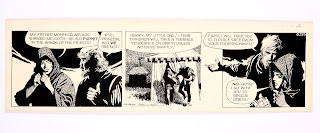
The second is from the story "The Women of Galba" (G84) and has some lovely Bellamy 'swirls' as I call them. These are the things that attracted me to Bellamy's 70s work - his design sense. In an alternate universe I think I'm a graphic designer rather than a retired Librarian! 

Garth: The Women of Galba (G84)

Garth 'Women of Galba' original artwork (1973) drawn by Frank Bellamy for the D. Mirror 7.4.'73. Indian ink on board. 21 x 7 ins

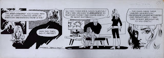
The third is from the story "The Mask of Atacama" (G225) and again we see those Bellamy 'swirls' shading the dark sky in the third panel. Garth is off stage at this point in the story but nevertheless a lovely piece of classic Frank Bellamy artwork.

Garth: The Mask of Atacama (G225)

Garth: 'The Mask of Atacama' original artwork (1973) drawn and signed by Frank Bellamy for the D. Mirror 21.9.'73. Indian ink on board. 21 x 7 in

That's a lot of gorgeous Frank Bellamy artwork coming to light. Best of luck with any you go for.  I'll update the spreadsheet as usual after the auction. Happy Bidding!

AUCTION SUMMARY

HAPPY WARRIOR

WHERE?: Compal/Saleroom
STARTING BID: £900 (Estimate: £1000-£1500
ENDING PRICE:£2,450
END DATE: Sunday 28 August 2022

BRETT MILLION AND THE GHOST WORLD

WHERE?: Compal/Saleroom
STARTING BID: £1080 (Estimate: £1200-£1600)
ENDING PRICE:£2,250
END DATE: Sunday 28 August 2022
 
HEROS THE SPARTAN 

WHERE?: Compal/Saleroom
STARTING BID: £4050 (Estimate: £4500-£5000)
ENDING PRICE:£3,800
END DATE: Sunday 28 August 2022

GARTH: The Wolfman of Ausensee

WHERE?: Compal/Saleroom
STARTING BID: £200 (Estimate: £220-£260)
ENDING PRICE:£280
END DATE: Sunday 28 August 2022

GARTH: The Women of Galba

WHERE?: Compal/Saleroom
STARTING BID: £230 (Estimate: £250-£300)
ENDING PRICE:£170
END DATE: Sunday 28 August 2022

GARTH: The Mask of Atacama

WHERE?: Compal/Saleroom
STARTING BID: £230 (Estimate: £250-£300)
ENDING PRICE:£240

END DATE: Sunday 28 August 2022


Wednesday, 3 August 2022

Frank Bellamy and lettering Garth comic strips

Garth: The Beast of Ultor (#H56)

I want to write something about lettering in relation to Frank Bellamy's work. In the Skinn and Gibbons' interview Bellamy answered the guys' question:

I should imagine your experience in making movie billboards stood you in good stead for the “splash” frames in your “Churchill” strip……
FB:  Yes. I did my own display lettering. I like to do my own lettering wherever possible. I always try to give a completely finished piece of artwork, on clean white board, camera-ready. The right size, bleed marked, something that an editor can send straight off to the engraver. This is getting on to technique, but I’ve seen artwork which goes so close to the edge of the board that there’s not even enough room to fit the reduction indication anywhere. I like to give a client a piece of board with a working area, where he can put any notes down the side – “Urgent”, “Infra-red” or whatever.

David Jackson commented to me: The graphics aspect - ruler-straight lines and title deign lettering and all large-scale compound curve lines (which many, particularly ‘fine’ artists would run a mile from - is the single aspect which FB had nailed first.

Bellamy began in a advertising studio in Kettering, his home town. It was here he learned the craft that he would follow for the rest of his life. When it came to comic strips in comics in the 1950s there would be an author who wrote the script; the artist who laid out, pencilled, inked, and maybe coloured his artwork. In later years the letterer would add text into balloons which might have been left empty by the artist or he (mostly 'he') might actually add balloons and then letter. I have read that some of the Eagle balloons were on adhesive film which was lettered and then added to the artwork. 

All three would have to understand each other. If the author produces reams of text, the artist knows it can't work in a panel. If the artist places a balloon such that the letterer has no room to create complete words - but hyphenated ones only, the letterer knows it won't work. And so on. A collaboration.

In an interview with Barry Askew for BBC TV (the film is lost but we have an audio recording) he was asked again about his method of working.   

BA: Tell me how one sets about drawing a Garth strip. Can you show me?
FB: Well, yes. In this way; there is a piece of board exactly the same way I would use for the Garth strip. Set it out in pencil in this manner and once again you’ll notice I break up the frames. I’ll show you on this one here. For the start, of course, there’s the balloon and stuff to go in, it’s about the most important piece of all.
BA: Does the scripting give you a problem? How do you relate the script to your er..to your work?
FB: I keep in general to the script. Occasionally you get little things that on a typewritten script don’t work visually. Then it’s up to me to er.. re-draw, or re-think, or present it in a different manner.
BA: How long would it take you in fact to do a complete Garth strip?
FB: Ah, that’s a difficult one. All I can say is that I have a complete bank of six a week and come what may, a deadline is a deadline, it’s a religion to me. And they have to have one every week.

From the outset, a lot of the strips Bellamy drew he lettered the boards himself. For "Thunderbirds" which was syndicated abroad, he left the boards with space for captions and balloons.

Bellamy poses with his completed artwork
for the "Thunderbirds" episode from TV21 #74

Thanks to Alan Davis rescuing many Polaroids of the original artwork from Bellamy's studio after his death, we can see the completed 'clean' artwork just waiting for captions and balloons.  

Garth was drawn to an established scale to accommodate the word-balloon lettering. The strip which ran in the Daily Mirror from July 1943, was created by Steve Dowling and Gordon Bushell. Bushell moved on to concentrate on his work as a producer for the BBC and therefore Dowling took an assistant, the 15 year old John Allard, who Dowling in a later interview said "I have my assistant John Allard to help me now and he supplies all the backgrounds and lettering". The word 'now' is interesting as Allard was there from the start - in Allard's own words: “I started work there as an assistant to Steve Dowling a few months before the creation of Garth in July 1943." Allard is certainly a great influence on this long-running strip.  

Dowling and Allard formulated a method of working whereby Allard would sketch out the strips which Dowling would then correct, inking in the main figures, leaving Allard to complete the inking of the backgrounds and do the lettering, a system which continued essentially the same for 25 years, with a break between 1946 to 1948 when Allard was called up for his national service in the R.A.F. and the task of inking fell to Dowling’s other occasional assistant, Dick Hailstone.

Allard remained Dowling’s assistant until 1969, when Dowling retired to run a farm and riding school [...] Allard took over the strip full-time, working with writer Jim Edgar until 1971, when Frank Bellamy was invited to take over the strip and Allard found himself relegated to drawing backgrounds for some months before Bellamy took over the strip full-time.

From Steve Holland's blog

In 1971 John Allard began the story "Sundance" and after 12 episodes, Bellamy came on board as the main artist, possibly in competition with the sophisticated decorative linework of the new rival 'Scarth' in the revamped Sun newspaper. However, here is where it gets hard to describe who did what (although we have attempted to distinguish things a bit in a series "Garth strips analysed").  But it seems clear that Bellamy left the lettering to John Allard from the start although there appear to have been some clashes here.

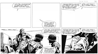
On Alan Davis' site he shows two examples of how Bellamy took Polaroids of what Allard suggested as a layout with balloons completed and how Bellamy wanted to see the layout - thanks to Alan for permission to use these images. Now I have to say I cannot prove this, but it seems the most likely explanation to me as to why Bellamy took the photos. He wanted to communicate this to a third party, is my theory.

Bellamy and Allard layouts for Garth: The Mask of Atacama (#G165)

The published version of G165

"The Mask of Atacama" story is significant in that it's the first of the seven stories Bellamy had drawn to date where he added his very recognisable signature. So it does not seem unreasonable to assume that he might have been presented.with the image above - Allard's drawn layout with completed balloons. Bellamy has drawn his version of the opening strip with pencilled balloon lettering to show the Cartoon Editor how he sees the script being interpreted. I suspect this is where they settled the confusion over Allard's part in "Garth" and Bellamy was left to complete the strip without fully lettering it.

I prefer Bellamy's layout here, as we have the intro panel first, followed by Garth's comment, whilst holding the mask, we see Professor Lumière and then the speaker of the second balloon - reading left to right. I find Allard's layout OK, but clumsy, as we have to read 'around' Garth's back to see who's talking.

Bellamy and Allard layouts for Garth: The Wreckers (#G279)

The published version of G279
In this second example I wonder why Allard laid out the completed balloons as it would appear to have already been settled who did the artwork (proof being FB signed the previous story as well as this one). But the choices Bellamy makes - in breaking up the dialogue - are illustrative of his design sense. There was too much talk in one balloon and the shorter "Next month!" aids the flow, in my opinion.

There are a few other things I'd like to mention regarding the lettering and corrections in the Bellamy version of "Garth". In The Beast of Ultor (#H56) - shown at the top of this article - there are firstly the pencilled words in the second panel visible under the inked version and secondly overlays of inked text stuck on, saying "Professor Lumière activated". What's underneath isn't easy to see, but I'd love to know.

Also in the example owned by and used with permission of Jonathan Wilson, H3, we can see a few overlaid pieces of text. In the first panel it looks like Allard might have misspelled 'instructions' and in the third panel 'beneficial'. Bellamy was proud of the fact he never used process white, 'white-out' or correction fluid, but in many original boards and balloons we can see Allard has resorted to this. Even perhaps unnecessarily,over tiny overlap lines which would have in any case been unnoticeable when reduced in reproduction.

Garth: The Wreckers (#H3)

In an email with me in 2015, Ant Jones had just interviewed John Allard and asked him something for me.

"In the strips department there was a guy called Ken White who did the lettering but sometimes he could be unreliable, so John would end up doing the lettering. John Allard does the lettering on F194 (and all the other strips in that story that aren't Ken). When John started on Garth, Stephen Dowling's main priority was to train John to develop his lettering so it could be used in Garth."

Garth: The Wolfman of Ausensee (#F194)

Garth: The Wolfman of Ausensee (#F193)

I wonder if John meant F193 was John's work and F194 was NOT - but that of Ken White - compare the two and see what you think. 

Lastly Dez Skinn presented a strip (G274) which again shows completed lettered balloons and Bellamy's version in his book Sez Dez (p78), following the same lines as we have discussed above. 

Garth: The Wreckers (#G274)

Just for completeness sake, I should say that, if anyone is wondering, John Allard did not do the lettering on the "Perishers" strip that also ran in the Daily Mirror, as Maurice Dodd explained that Dennis Collins, the earlier artist, did it - The Perishers Omnibus No.3 - Thanks to David Jackson for reminding me!

I have yet to say anything about the markings and dates on the original artwork borders but that's for another time.

Thursday, 14 July 2022

ORIGINAL ART: Garth - a quick article

Garth: K125

Garth: K125

Garth: K125

My daughter is getting married so I'm in a hurry but wanted to let you know that Darryl Jones of Silver Acre Comics (who has been on ebay for years - and I've happily purchased from him) has  a Garth up for auction.

It's strip number K125 from the story "The Spanish Lady" which ran in the Daily Mirror originally from 17 March 1976 - 7 July 1976 - K65-K160

The starting bid is £299 and he has a minimal description so here's some subsequent strips for your pleasure

K125 - K129 Garth: "The Spanish Lady"


AUCTION SUMMARY

GARTH: Spanish Lady
WHERE?: eBay: silver-acre
STARTING BID: £299
ENDING PRICE:£0 - No bids
END DATE: 21 July 2022


Friday, 1 July 2022

The Art of Frank Bellamy - reviewed by David Jackson

ILLUSTRATORS - The Art of Frank Bellamy written by Norman Boyd; design and layout Diego Cordoba; Publisher: Geoff West - London: The Book Palace, 2021
 
A Review by David Jackson.

An early draft of the cover!
 
Frank Bellamy, in the inspirational Fantasy Advertiser (Vol.3 No.50) interview by Dez Skinn and Dave Gibbons, says "This kind of work has been under-rated for many years. Throwaway artwork to be looked at and immediately discarded. This is a viewpoint I strongly disagree with."

Here in book form is the material repudiation of the throwaway.

Which itself was a 'here today - gone tomorrow' outlook derived from its origins in the tomorrow's fish and chip paper newspapers print industry.
And all through the half a century or so since, a book by such a title, or one like it, has been discussed by any and all of those with more than half a chance of making it happen, but without immediate success.

As it says in the Introduction, by Oliver Frey, it's been long overdue.

Though there have been many very fine books of compilations featuring single strip examples of Frank Bellamy artwork in genre overviews, as this new volume's detailed bibliography attests.

And throughout those decades these same guys responsible for this latter publication have been working away tirelessly to bring volume after volume of so much great illustration to us all.

In our enthusiasm for the abilities of great artists, the contribution made by the commissioning editors and publishers who made the existence of the work possible in the first place, is often overlooked.


The first full page image in this collection, acting as a frontispiece, is a singular choice in itself, and in its own way, unique. This is the full page portrait of Sir Winston Churchill (described on p40) which, as the footnote to the image states, appeared on the Eagle back page on the week following the concluding episode of 'The Happy Warrior'. Inexplicably [see below ~Norman] it was omitted - possibly in a simple error - when the picture strip biography was first republished in book form.

This page in its day could be seen as a kind of flag and benchmark signal of intent raised by the artist himself at the conclusion of the first stage of his arrival in the form in which he would be pre-eminent.
The Art of FB -p2
Originally published in Eagle Vol:9:36 (6 Sep 1958)

The very next week following publication of the Churchill portrait page, Bellamy's 'The Shepherd King' began the next stage of his career in comic strips as we have come to know them.

As the Introduction also notes, hitherto, for Swift, the picture strip element of the format was seen as an adjunct to the supplementary blocks of typographical text which explained the action.

And although previously 'Monty Carstairs' was in a comics page format, stylistically it was in the established industry standard for that publication at the time.

Even 'The Happy Warrior' was an example, as FB himself noted, of "non-continuity picture strip".

Its subsequent republication in book form (with special presentation format volumes for the creative team, and for Sir Winston Churchill himself), indicates the level of prestige inherent in the project.

Possibly the economics and sales failed to meet management expectations of the time. Possibly the potential market already had, and substantially had kept, their copies of the weekly instalments in Eagle. Then again, the potential for album book form collection of the comics genre, firstly to the English speaking countries abroad, was there. Or even non-English speaking countries nearer to home, as an educational tool, even, in a primarily visual medium, and with a biographical and recent historical subject as Sir Winston Churchill in the immediate post-war decade.

The potential for single-title book volumes of strips first published in portmanteau weekly instalment comics like Eagle remained unrealised by inherently short-termist publishing.

So 'The Shepherd King' which immediately followed had the same educational or improving ethos depicted in a never-bettered action adventure picture strip format. Again ideally suited, you might think, for a single title book compilation and mass market sales in any English speaking Christian country.
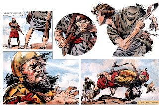
The Art of FB -p43
Originally published in Eagle Vol:9:48 (29 Nov 1958)

That such speculation, with twenty-twenty hindsight, is made obvious by the subsequent story of 'Marco Polo' which Frank Bellamy began but then did not complete, as that kind of stylistic consistency was simply not recognised editorially as a material consideration - and which directly led to all the events which then followed.

ILLUSTRATORS - The Art of Frank Bellamy is a comprehensive overview of the artist's stylistic development and life, fully illustrated with colour reproductions (where so in the original publication), many either mostly unseen since originally published and fully deserving to be known more widely. All of which is the product of so much dedicated research by the author and without which so much of the work presented here for the first time would simply be unknown, even to the dedicated fanbase.

The full colour reproductions are particularly fine in every sense. Especially the selection of large-scale frame details, and previously unpublished sketches, and the full size, almost full original pages, facsimile reproductions from the original art boards.

Page after page of full colour artworks makes up the greater part of this volume, one succeeding another as if to outdo it in demonstrating invention and versatility.

The accompanying text covers the events of the artist's professional and personal life reported in the public domain through the artist himself, colleagues and family members.

The idea that if you personally know something about any subject reported in the media, you will invariably know some reported detail to be mistaken. This has even applied to much of previous, and otherwise excellent, published commentary on this same subject. 
 
In terms of examples of the early days of Frank Bellamy's developing technique, most of us, who first encountered his work later on, fully formed, would be hard put to have identified any of these various 'industry standard' styles (political/sporting newspaper cartoons, romance illustrations, scraperboard), as being the same artist's work at all!

The publishing philosophy context of the contemporary picture strips (not fully comics as such) - in contrast to the material of concern then seen in America - is explained.

On page 32 some might read a seeming contradiction with Frank Bellamy's explanation for his use of stipple gradation that 'a printer cannot water his printing ink' (see p108) - with the use of colour or monochrome greys watered inks by the artist - the former being in relation to black or white newspaper print reproduction, in contrast to the half-tones used in Swift or the monochrome third page of the early 'Thunderbirds' in TV21.

As the numerous examples here show, the identifiable Bellamy style developed week by week. over time, within the genre of his early action-adventure picture strips.

There is a beautifully enlarged stipple and colour frame of Churchill (p38) indicating the precision of the original.

On page 48, continued on page 58, (also see p108) Don Harley and Peter Jackson air some personal opinion of the dot stipple pen and ink technique; examples of which feature in the frame detail enlargement on the cover, and in the state of the art full page Churchill portrait graphic. An application which can also be found in Ronald Smith's 'Teach Yourself To Draw' (1942/1954), if possibly not by the same means. As R. Smith showed in words and examples, the pre-existence of raised-surface technical boards is a more likely origin, from FB’s studio experiences, for the stippling technique. FB's method found limited application among the 'Dan Dare' studio team but subsequently can be seen in the work of many other artists, and also the stipple effect has even been created by special applications in black and white photography.
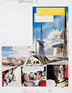
The Art of FB -p50
Originally published in Eagle Vol:11:1 (2 Jan 1960)

Among the classic original pages included for facsimile reproduction in this volume, are some Bellamy 'Dan Dare' front pages, and of the rather wonderful alien view of the city of Lantor. Author Norman Boyd asks readers to be the judge of the practicality of some of the futuristic designs, reflecting some of the reader reaction at the time, which has been brought to light since, and specifically in relation to some of the schematic forms drawn to the given Eagle editorial revamp brief. And possibly overlooking FB's own words which were not included in the FA #50 interview but appeared in the subsequent reprint in Warrior:

New owner Longacre Press lost no time in commissioning an updated new look for the Eagle masthead and front page, and particularly for 'Dan Dare'.

Frank Bellamy: "They asked me to redesign Dan Dare. The uniforms, space fleet, everything. This meant I had to make sketches of everything before I actually started drawing the strip, but I prefer to do that, anyway. I've always done so, on Fraser, Heros and so on. This let the editor know exactly what everything looked like from the start so he wouldn't get any surprises sprung on him in the middle of an instalment."

Fantasy Advertiser: "Did you have any qualms about re-vamping Frank Hampson's personal creation?"

FB: "Oh, yes. I didn't like doing that. But it was a directive from upstairs - that's what they wanted, and you can only give the client what he wants, so that was it."
Republication of the Fantasy Advertiser interview in Warrior 22 (September 1984), with some variations, included additional art and this extra Q&A:
"Why did you get the directive to revamp the costumes and ships?"

FB: "I think it was just the march of progress. They had tended to look old fashioned, and they wanted to keep ahead of what was happening in Cape Canaveral. At the beginning of EAGLE, everything looked super-futuristic, but the actual real life events were catching up extremely fast. They also wanted a 'new look' to coincide with the facelift the cover was getting. I did lots of drawings of the space fleet which were exploded drawings, showing the cabin areas, undercart, rocket compartment and that, which I'd hoped was also help an author so he wouldn't make the common mistake of having someone stepping from one cabin to another, when they are supposed to be at opposite ends of the ship. I tried to keep a realistic approach. Later, there was an exhibition, I think it was at Charter House School, showing 'the birth of the comic strip', and they used my approach, with my art, preliminary sketches, the script, pencil and ink artwork. The interest was so great that members of the American Air Force would go down, thinking these diagrams of ships were for real."

Laughter
The 'Fraser of Africa' section of the Illustrators volume features some engaging contemporary photos of Frank at his desk and with his collected Africana.

The 'Montgomery of Alamein' graphics and pictorial journalism ‘non-continuity’ picture-strip examples are spectacular widescreen cinemascopic spread format with side-to-side single frames, as used to advantage later in 'Heros the Spartan'.

The example of 'Only the Brave' is again pictorial journalism which faces a facsimile of the original page with its printed page opposite for direct comparison.
Art of FB p.69
The 'Heros the Spartan' pages include a large scale b/w reproduction of a sheathed dagger; one of the historical artefacts FB used as title-decorations in the series. Although it is not possible to tell from a printed reproduction, knowledge of Frank Bellamy's avoidance of process white and other opaque means of creating 'negative space' means that all the clever overlapping white space detail of the dagger must have been allowed for and created in the application of the ink..!

The 'Heros' frame detail enlargements and spectacular double-page spreads includes the American Academy of Comic Book Arts award winning episode, exhibited in New York in 1972. [pp.72-73~Norman]

The 'Ghost World' science fiction series for Boy's World comic, seen in retrospect, looks like an inadvertent job application to draw 'Thunderbirds' for TV21.

In the many examples of 'Thunderbirds' double-page spreads and frame enlargements, it is difficult now to appreciate how technically detailed, novel and convincing these were and are. Authentic looking technical interiors and equipment and the like were noticeably more often than not absent from TV and cinema of the time. Even the drawn explosions, which regularly featured as special effects in Gerry Anderson TV series, were always an identifiably Bellamy trademark, unmatched by his contemporaries.
 
'Garth' and the Apollo 11 Moon Landing are strong black and white works for the readership of Mirror newspapers.
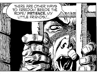
The Art of FB -p138
Close-up of panel in "Garth: Wolfman of Ausensee", originally published in Daily Mirror

The large facsimile frame detail of the Wolf-Man (from 'Garth') is referenced in terms of the cast shadow scribble tonal. A Frank Bellamy technique first tried in Mickey Mouse Weekly 'Monty Carstairs' series. All of which indicates a developing stylistic technique and not one found previously ready-made or in use in other art. The problems of pen and ink which scribble tone solves is firstly the 'antique' appearance of line and hatch/crosshatch - unless an antique look is what is wanted. And this necessity of hatched tones either following the form, or not. Another problem involves the weight of the lines (hatch) and the possibility of their being adjusted later if too light, or then being too fine and too many. These sorts of problems being the wrong ‘look’ for superhero comic books and what to avoid is well demonstrated in ‘How To Draw Comics The Marvel Way’ comparing their normal look for colour comics b/w with more overworked hatching of the same frame and how wrong crosshatch looked in that context.

Any number of examples of mostly full colour illustration commissions for 'The Winged Avenger', some technically experimental rendering of World War One for Look & Learn, Radio Times, Sunday Times and advertising, etc, may prove unfamiliar to even the most informed fans.

This volume draws to a conclusion with a portfolio of naturalistic life class figure studies in pencil and chalk.


Interestingly - at least to me - the final image in the volume is a fine pencil sketch of Robin Hood’s Bay - as I had also sketched the self same scene, from that exact same spot, but in the summer of another year. 
 
~David Jackson
Art of FB p.144: Robin Hood Bay

Thanks to David for his kind words and tying up a lot of what I put in this long overview of Frank Bellamy's life and work. But despite his kindness, errors did creep into the text which I've kept up to date on the page where I first told folks about my magnum opus one year ago!

==============================

Many thanks to David Jackson for providing such a fulsome review. After reading it David Slinn reminded me of a previous conversation which explained the lack of Churchill's portrait - 

The 48 episodes provided convenient signatures of the colour pages [although this meant Frank’s impressive final full-page portrait wasn’t included], with a further 8 black & white pages of editorial and photographs.  From: Downthetubes

 ==============================

The Art of Frank Bellamy can be purchased from Book Palace. Details are:

Authors: Norman Boyd, Oliver Frey (intro)
Artist: Frank Bellamy
Publisher: Book Palace Books, July 2021
Number of pages: 144
Format: Soft Cover; Full Colour illustrations
Size: 9" x 11" (216mm x 280mm)
ISBN: 9781913548087

Monday, 13 June 2022

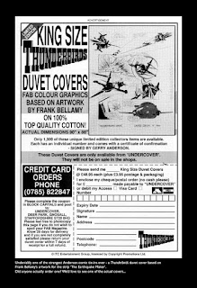
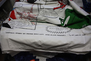
Frank Bellamy and The Thunderbirds Duvet!


 Yes, you read the title right. I received this from David Finchett:

Hi Norman,
I read your Frank Bellamy article about this duvet cover on your website and thought you might be interested. It was a limited edition duvet cover of 1000
so not many are about. I enclose a photo. I am going to put it up on ebay when I get time.
At 200cm x 220cm it's awkward to photograph!
Kind Regards
David Finchett
Original advert 1992 (Thanks to Shaqui)
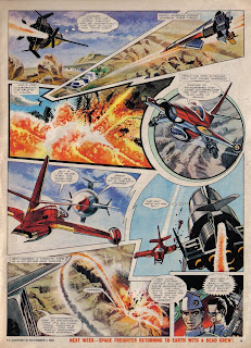
The original story - as credited on the quilt - was written by Alan Fennell and drawn by Bellamy.
TV21 #146 p18

TV21 #146 p19


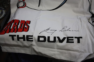
I have stored some other images from this quilt which I've found over the years, so here you go for those interested! As the advert suggests these 1000 limited edition were autographed by Gerry Anderson. I presume no-one dared wash these!

Credit for the story

Actually autographed by Gerry Anderson


There have been other duvet covers but not with Bellamy's art on them.

Wednesday, 1 June 2022

Frank Bellamy and John Tornado

 JOHN TORNADO: der Mann mit den tausend Masken [The man with a thousand masks]


John Tornado #1 cover by ErtuÄŸrul Edirne
An old friend of the blog, Bill Storie asked about German reprints of Garth. I list all known international instances of Frank Bellamy and his artwork so you'll see that "John Tornado" is what Garth was called in Germany when he appeared between 1979-1981. There were only 20 issues of the 50 page comic published fortnightly by Bastei Verlag, which included a second strip "Stargo", more on that later. The last 4 issues were illustrated by Martin Asbury so fall outside the scope of this blog, but I've listed them below for completists.

Firstly, notice the sub-title "The man with a thousand masks", which I presume is how the German Editor (named as Manfred Soder) at Bastei Publishing explained the English time-traveller who goes to all points of the compass and travels through time!

There are 24 pages of Bellamy strips in each issue but - and here's the interesting thing - the strips are coloured red (with the black and white left as is - mostly!) and cut up, shrunk and enlarged and also 'foreign' panels added by another artist. The single colour is not unusual in UK comics (even the 1970s Marvel comics first appeared like that in the UK). 

John Tornado #1 p.1
My translation of the paragraph above - which appeared in each issue (with a new introduction on the relevant story):

A balloon floats out of the steel-blue sky over Tibet and lands on the roof of the world. A young man lies unconscious in the gondola. Where does he comes from? From a European country? Maybe even from the starry world? The man remembers nothing. They give him the name JOHN TORNADO. Soon he has to realize that the laws of space and time do not apply to him... The man who came out of nowhere experiences breathtaking adventures in the past, present and future. Are his fights dream or reality? John doesn't know himself! Perhaps the beautiful goddess from the world of stars knows the secret of the man who has to face ever new dangers in a thousand masks. She always encounters John when he is in grave danger. But in human form she cannot intervene. The moments of reunion are only short, then she has to go back... to where, maybe, JOHN TORNADO came from...?

The following is the opening page of the strip in issue 1 which you'll no doubt have identified as "The Women of Galba". There is only a piece of Bellamy's original drawn title - obviously because the original is in English. Then note the top 'banner' which fills space. There are four of these collage images which rotate through the 24 pages. Also of interest is that nudity is covered by bikinis and other underwear! It was a children's comic after all, but surprising as I remember the 70s magazine displays in Germany as showing a LOT more than Bellamy's drawings portrayed!

John Tornado #1 p.2
Here are the first three episodes of the original publication in the Daily Mirror  to make your own comparison


Later in the story we see other panels enlarged, I assume to justify the first page's enlargements.

John Tornado #1 p.12

For those who are keeping track, I looked at Issue 10 (The Wreckers) in case the Daily Mirror sent Germany the Daily Record strip and the answer is no! Ditto for issue 8 (People of the Abyss).

Here are some more assorted pages, note particularly the large panel in issue #6 :

John Tornado #2 p.16

John Tornado #4 p.9

John Tornado #5 p.25

John Tornado #3 p.27

John Tornado #6 p.7

Here are some more pages by, I suspect, the cover artist  ErtuÄŸrul Edirne which are interesting as they show the Garth characters

John Tornado #2 p.28

John Tornado #11 p.1


John Tornado #2 p.35 pin up of Stargo

STARGO

To read details of who did what on the strip, you can't do better than RalfH. I also wrote to Peter Mennigen on Facebook - an author of an extraordinary amount of German comics including the excellent "Malcolm Max" which ironically, being a Victorian demon-hunter in London, is not available in English...yet! 

Hi Norman, the original title of "Stargo" is "Tenax". But Frank Bellamy has nothing to do with it, his series "John Tornado" appeared first in "Stargo" before he got his own 15-issue series. The author of "Stargo" is Pedro Muñoz. The artwork is by José María Ortiz Tafalla (who also drew many of my "Phantom", "Ghost Stories" and some "Vanessa" Comics.) The cover artist of the "Bastei" books is Ertugrul Edirne. More information may be found in a " Bastei Freunde" magazine, which deals with the topic "Stargo" in detail. Unfortunately, I don't have the magazine here, so I don't know how helpful it could be. - Kind regards and have a nice weekend - Peter

Lastly I should mention the indicia state that copyright is held by Bulls, Frankfurt am Main and Syndication International, London. ("Stargo" is copyright Imperia/Graphlit)

Back page of John Tornado #1
Translation of the "breathtaking" adventurer's next episode in 14 days!:

Nobody knows the secret of the fighter with a thousand masks. As a lone wanderer
he is chased through space and time by powerful opponents. JOHN TORNADO has to face incredible dangers in the past, present and future.
In the next adventure, JOHN TORNADO stays in a ghost town of the Wild West. The wind howls eerily through the shattered windows of the Star Saloon... A swinging door creaks... Suddenly the ghost town awakens to new life. And JOHN TORNADO wears a new mask: As the sheriff of Silver City, he hunts down a ruthless gang...
And as a bonus, just for Bill, here's the pin-up from the centre pages of issue #1 where we can see some of Bellamy's art and the rest, I suspect is by ErtuÄŸrul Edirne.

John Tornado #1 centrespread

STORY LISTING

John Tornado #1-20
Covers by ErtuÄŸrul Edirne
LISTING OF GARTH STORIES
 

  1. Die Gefangene des Gladiators [The Gladiator's Prisoner] = The Women of Galba
  2. Duell in der Geisterstadt [Duel in the Ghost Town] = Ghost Town
  3. Der Dämon in der Zauberkugel [The Demon the Magic Bubble] = The Bubble Man
  4. Im Hinterhalt der wilden Horde [Ambushed by the wild horde] = The Bride of Jenghiz Khan
  5. Die Schreckensreiter von Montana [The Horror Riders of Montana] = The Angels of Hell's Gap
  6. Aufstand der Galeerensklaven [The Galley Slaves Uprising] = The Orb of Trimandias
  7. Die Verräter von Soho [The Traitiors of Soho] = Freak Out to Fear
  8. Die Ungeheuer von Azlan [The Monsters of Azlan] = People of the Abyss
  9. Die Meuterei der Roboter [The Robot Mutiny] = The Doomsmen
  10. Fluß ohne Wiederkehr [River of no return] = The Wreckers
  11. Der Fluch von Atacama [The Curse of Atatcama] = The Mask of Atacama
  12. In der Arena des Tyrannen [In the Arena of the Tyrants] = The Beast of Ultor
  13. Das Rudel der grauen Wölfe [The Grey Wolfpack] = The Wolfman of Ausensee
  14. Die Verschollenen des Alls [The Lost Ones of the Universe] = The Cloud of Balthus
  15. Die Menschenjäger von Ikonos [The Manhunters of Iconos]The Beautiful People
  16. Die Galeone des Teufels [The Devil's Galleon] = The Spanish Lady
  17.  Der Hexer von Darkville = The Long Sleep
  18. Die Sendboten des Unheils = Sapphire
  19. Die Wächter des vergessenen Sterns =  Finality Factor
  20. Die Garde des Teufels = Power game

Thanks to Sammlerforen.net's John Tornado thread here's the chronological reading order for Garth in German:
14, 6, 13, 8, 1-2, 11, 10, 12, 7, 4-5, 9, 3, 15-16, 18-20, 17 but of course you are missing Sundance (Bellamy's first Garth story and "The Man-Hunt" his last.

I'm grateful to the German Comic Guide and http://ralf-h-comics.de/comics-jt/001.html for their information.